A 1980s Condo Goes Retro Vintage
We needed the amenities of our modern condominium complex — but that didn’t stop us from completely transforming it, in two period styles!

Anyone who knows me will say I belong in the past. Victorian style and even more recent eras like the 1950s captivate me with their color, patterns, and decorative detail. For more than thirty years I designed rooms for myself that would have felt comfortable to the Vanderbilts and the Carnegies. A Victorian in Redwood City, followed by another near Chico, California, gave me the canvas to play out all my deepest Gilded Age decorating urges.
It’s a little ironic that I should end up, in retirement, with my husband Larry, in a high-rise condominium complex that was built in the 1980s (and hasn’t been remodeled since). Our health no longer lets us live where we want, so a few years after moving here we decided to bring a little bit of that old-time magic to three rooms: the living room, solarium, and galley kitchen.
Victorian Vision
High Victorian in the living room and solarium. We gutted all three rooms just a few months before COVID struck. For nearly a year we lived with plastic curtains dividing the construction sites from our bedroom and bath. Supplies and appliances took weeks, even months, to arrive. The microwave oven kept us fed. We persevered.
|
|
|
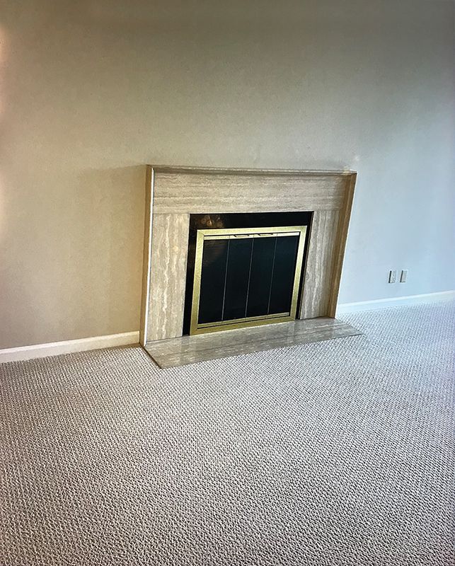
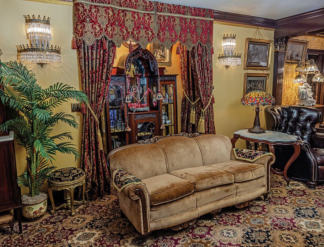
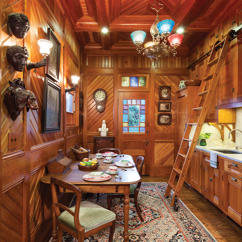
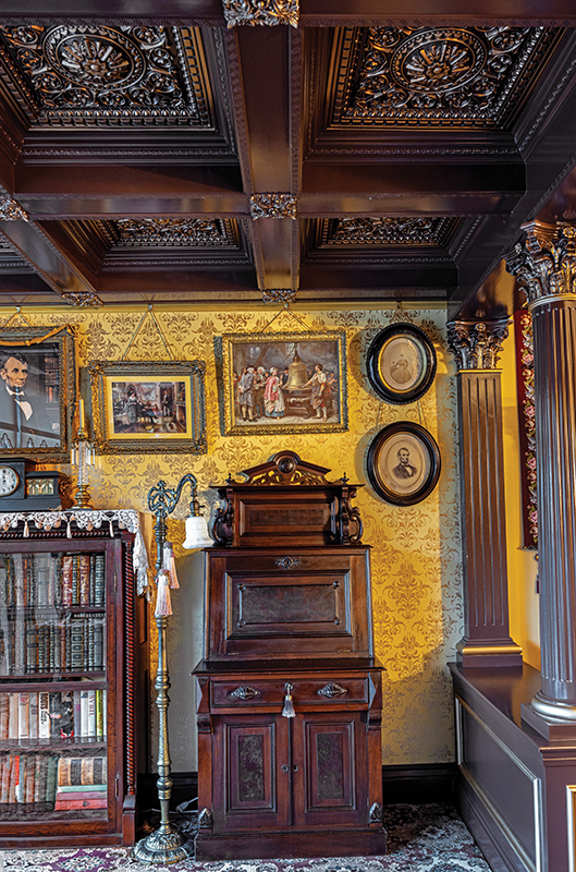
Larry listened to my ideas and drew them all on paper: oak columns to divide the living room and solarium; tall crown moldings and picture rails; coffered ceilings in the solarium; a large alcove in the living room carved out where the fireplace used to be. This last came with a huge bonus: Because we could cut away the pipes and vents, we gained nearly 20 square feet of space. What you don’t see behind those gorgeous drapes are storage areas on each side of my beloved étagère.
Taking out the glass divider between living room and solarium gave our living space a grander, more expansive feel. We ripped out the beige carpet and replaced it with English wool carpet in a 19th-century floral design.
I was able to modify most of our drapery from previous homes, cutting down lengths to fit our modest 8 ½-foot ceilings. I did add 220 inches of fringe and bullion.
Diner Design Inspiration
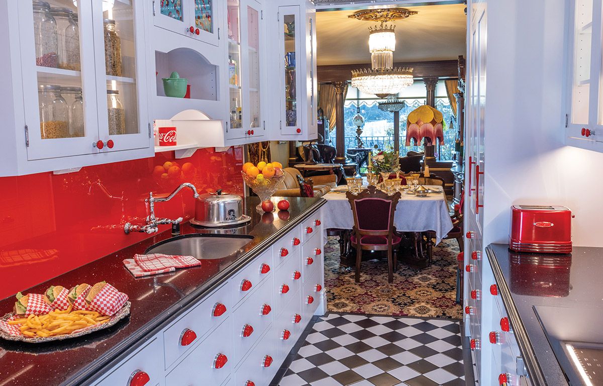
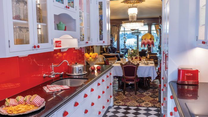
Homage to the 1950s diner in the kitchen. The original kitchen was uninspired; a narrow galley with a back window that looked out onto a concrete wall. I’ve always loved old diners and soon after moving in I started imagining my kitchen as a welcoming place of bright colors, cabinets with red enamel cup pulls, and appliances hidden away.
What to do about that dreary back wall? I envisioned a huge mural depicting scenes at a drive-in diner. That’s how my design ideas come to me, big and vivid.
Bob’s Big Boy is a popular hamburger chain that began in the 1930s and had its heyday in the 1950s in Southern California. I fell for its cheerful red-and-white checkered palette. We found the mural by artist Larry Grossman at Murals Your Way and then built out the cabinetry, tin ceiling, and tile flooring.
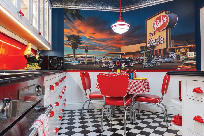
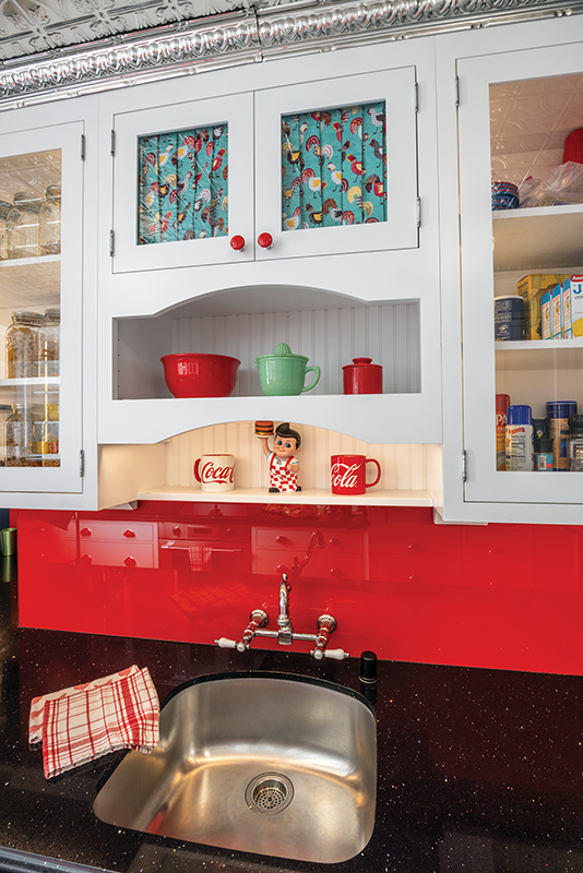
I ended up with much more cabinet and counter space. Cabinets were custom-made by an Amish cabinet-maker; I prefer drawers over doors, so that’s what I designed. I call the 66 red-enamel pulls my ladybugs.
Our contractors were amazed by the level of craftsmanship and detail we insisted on. Larry and I poured our hearts and souls into this huge remodel. It cost a lot and was exhausting. Now, in the evenings, we sit and enjoy every inch—it was totally worth it.
— Written by Cathy Hefner. Photos by Tom Hauck. Story produced by Erika Kotite.
RELATED STORIES
-
The galley kitchen’s gleeful nod to 1950s drive-ins features an extraordinary mural depicting Bob’s Big Boy, a well-known California hamburger-stand chain.
-
Cathy and Larry Hefner have been married for 34 years. Cathy worked for years in the California penal system and Larry in law enforcement before retiring to pursue their true passion: restoring or re-creating Victorian houses.
-
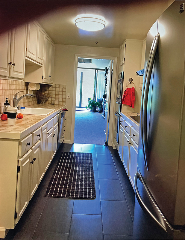
Before: It had been a typical condo kitchen, serviceable but with only one prep space. The new layout moved the refrigerator to the end and added a second countertop.
-
Amish cabinetmakers fulfilled Cathy’s vision of a retro kitchen, complete with a fanciful cutout shelf. The red backsplash color was matched to diner chairs and is baked onto the back of the glass.
-
This is not just a “pretty face” remodel—the kitchen now has significantly more storage and working space than before. Pullout “drawers” cleverly disguise a dishwasher to the left of the sink and a refrigerator opposite.
-
Before: Monochromatic minimalism. The condo’s fireplace was removed, uncovering about 21 square feet of additional space for an alcove.
-
The 1880s étagère is flanked by elaborate drapery panels and a scalloped lambrequin, designed and made by Cathy.
-
The formal solarium has a coffered ceiling and stenciled walls. Corinthian columns replaced glass doors that had blocked light.